- Jeffchen2121@gmail.com
- +86-18688742252
- Language
Technology | What to do with the nine most difficult colors to print in kraft chocolate boxes
Thu Jul 07 18:49:51 CST 2022
The packaging and printing industry involves a wide range of issues, and there are many issues that need attention. According to the printing experience of industry professionals, the following nine difficult-to-print kraft chocolate box colors and some pre-press design precautions are listed.
1. Gray balance, according to the experience of theory and production practice, the most difficult color to control for kraft chocolate box is gray balance.
The gray balance of the kraft chocolate box is that under a certain printability, the three primary color versions of yellow, magenta and cyan are superimposed from light to dark according to a certain dot ratio to obtain achromatic colors of different brightness (white, light gray, gray, dark gray, black) ), that is, to get the color of visually neutral gray, there are many factors that affect it, the amount of ink used for printing, paper, full plate density, dot area, overprinting and the number of screen lines will all affect the gray balance of the kraft chocolate box. The influence of Wanwei, which is the most test of the overprinting accuracy of the machine and the skill level of the operator.
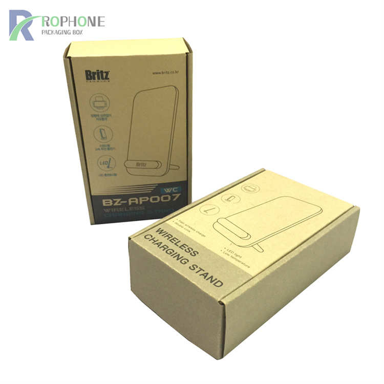
2. Fully printed kraft chocolate box:
4-color cross-screen and 3-color cross-screen, the kraft chocolate box with full color is recommended to use special color printing.
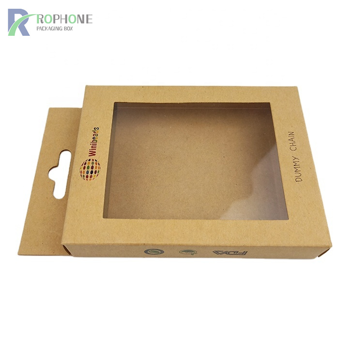
3. Kraft chocolate box designed by people who don't understand printing:
Kraft chocolate boxes designed by people who don't know how to print are the hardest to print. Color is on the one hand, too many very fine, very small characters are white and so on.
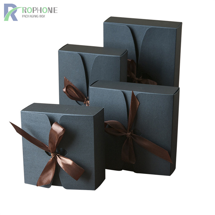
4. Large flat screen printed kraft chocolate box:
C=50, M=50, Y=50, K=50 large flat net kraft chocolate box, if there is a little bit of inaccuracy, the color cast will be serious.
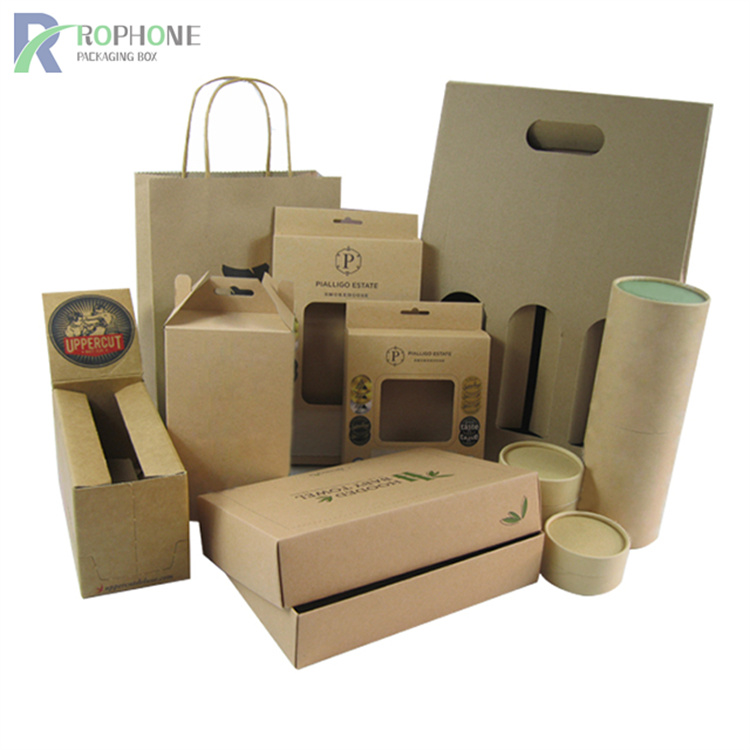
5. Kraft chocolate box with text in four colors in CMYK:
The text is a four-color kraft chocolate box, that is, there are texts in the four colors in CMYK, especially small words, it is difficult to fit, and the gripper of the machine is extremely demanding. This is also a relatively common problem, so the prepress designer must check the black text in the kraft chocolate box file, especially the small text, whether it is only on the black version and should not appear on other three-color versions.
If it appears, the quality of the printed kraft chocolate box will be greatly reduced. When the RGB graphics are converted to CMYK graphics, the black text will definitely become four-color black. It must be handled unless specifically specified.
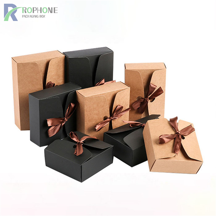
6. kraft chocolate box with black bottom:
The kraft chocolate box with black bottom is also not easy to handle. In order to achieve the effect of black background, you can use special black ink or print twice, it is not difficult to print, and it is more labor-intensive.
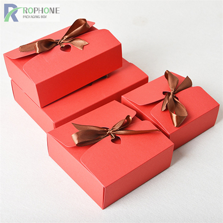
7. Kraft chocolate box with superimposed dots of several colors, especially over 70% dots.
Specifically, dark brown, brown, dark green (flat screen, containing blue 70), dark blue, purple blue and other kraft chocolate boxes, due to the color difference, it is difficult to find a balance on the printing machine, so it is difficult to find a balance. Printing colors.
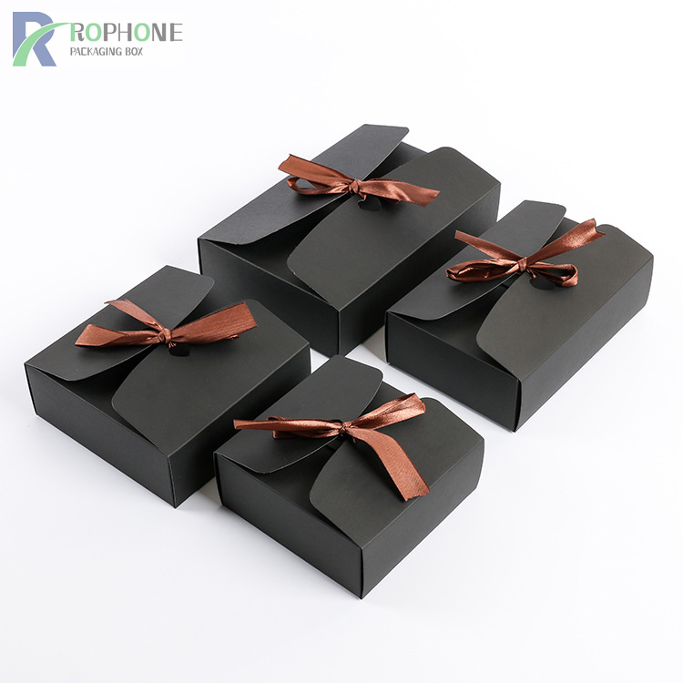
8. Full-page content, spot-color full-page or large kraft chocolate box
Generally full-page content in printing, full-page spot color or kraft chocolate box with a large area, reverse white characters, the same logo, and the same color block, it is generally difficult to follow the color, and it is easy to produce color difference, ghosting, and smudges. , scratch phenomenon.
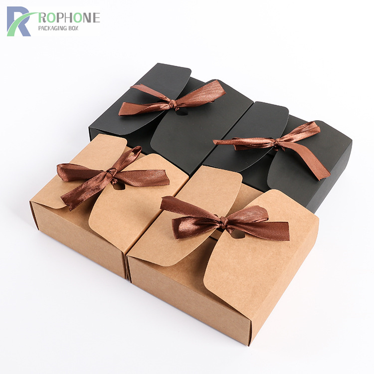
9. A kraft chocolate box with gold and silver tiny text:
The kraft chocolate box with gold and silver small text is afraid of dry printing in the batch process. These must be controlled in place during the operation process, the printing plate should be wiped clean, the ink viscosity should be controlled at about 14, and attention should be paid to the dry printing.
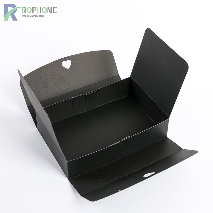
10. Qualified kraft chocolate box printing must meet:
1. Overprinting is accurate;
2. The ink color is uniform;
3. The outlets are full;
4. Ink balance;
5. There are no printing faults in the printed products, such as dirty, scratched, patterned, pasted, etc.;
6. Be strictly faithful to the original.
We have to pursue high-quality kraft chocolate box, in order to adapt the product's kraft chocolate box to people's increasing aesthetic concept.
