- Jeffchen2121@gmail.com
- +86-18688742252
- Language
-
 Español
 -
 Português
 -
 Portugiesisch
 -
 Français
 -
 日本語
日本語 -
 Български
 -
 한국어
한국어 -
 Türkçe
 -
 Nederlands
 -
 English
 -
 Eesti
Eesti -
 Suomi
Suomi -
 বাঙ্গালি
 -
 беларуская
 -
 Ελληνικά
 -
 Kreyòl ayisyen
 -
 עִברִית
 -
 हिन्दी
 -
 Magyar
 -
 íslenskur
 -
 Gaeilge
 -
 italiano
 -
 Hrvatski
 -
 Latinus
 -
 latviski
 -
 Melayu
 -
 Malti
Malti -
 Монгол
 -
 မြန်မာ
 -
 فارسی
فارسی -
 Polski
 -
 عربي
عربي -
 Română
 -
 русский
 -
 slovenský
 -
 Slovenščina
 -
 Afrikaans
 -
 svenska
 -
 dansk
dansk -
 український
 -
 o'zbek
 -
 Cymraeg
 -
Zulu
-
 Tiếng Việt
 -
 bosanski
 -
 Deutsch
 -
 eesti keel
 -
 ไทย
ไทย
-

Global kraft chocolate box packaging and design: chocolate packaging [Part 2]
Mon Jul 04 18:21:15 CST 2022
10. LOCOletter kraft chocolate box:
Leverage scraps to create an ideal, sustainable kraft chocolate box design for premium chocolate. LOCOletter is a candy associated with the Dutch festival of St. Nicholas. Every December 5th, people celebrating Santa Tecla receive their initials made of chocolate. As heartwarming as this tradition is, more than a million chocolate letters, including kraft chocolate box packaging, are destroyed as waste every year.

The kraft chocolate box packaging is designed using cardboard, a blend of cocoa husks and FSC fibers. The kraft chocolate box's premium transfer finish with a metallic mirror finish will be made from recycled materials. The kraft chocolate box uses a combination of what would have been scraps to help elevate the local letter to a satisfying and sustainable brand.

11. Mood Chocolates kraft chocolate box:
Such a kraft chocolate box, do you feel how I feel when you eat chocolate? Soothe your taste buds by introducing the perfect blend of flavours and cocoa percentages according to your needs. The purpose of this packaging is to come up with the concept of customizable different flavours and different percentages of cocoa content in each chocolate. Inspired by anime, the kraft chocolate box packaging is sure to satisfy you and do justice to what's inside.

What is the unique kraft chocolate box?
Anime-inspired kraft chocolate box packaging, individual packs for each chocolate bar more than a standard box in one bar & a different percentage of cocoa per bar in one bar.

12. Malaysian made Beryls kraft chocolate box:
A rebranding project for local chocolate products in Malaysia to encourage tourists to bring back meaningful gifts and a part of Malaysia. The concept of this kraft chocolate box packaging is to market fun ideas and more convenient ideas to users. The message of the illustrations is to show the audience the faces of Malaysians. These colours are used to add value to the idea of being fun, bright, friendly and charming, just like the characteristics of Malaysians.

13. One design solution - crumbly kraft chocolate box:
The main purpose of this kraft chocolate box packaging design is to solve the problem of opening the box and then opening the foil and allowing the chocolate bar to be consumed for too long. The kraft chocolate box design solution was to open the chocolate in a shorter and simpler way by breaking the box wrapper and foil together. It is also a more interesting and interesting interactive solution for the user.

14. Vive kraft chocolate box:
A bright color palette ensures our kraft chocolate box designs pop on the shelf, while the natural rounded lettering and indulgent dark chocolate-coated corners communicate health and flavor.

The kraft chocolate box illustration carries over to the second tier and extends into the wider world of the brand, repeating across the wider canvas for a strong brand shield or delivering a single stack. In conclusion, a perfectly balanced kraft chocolate box represents a perfectly balanced product.

15. MILTOS x BOTCHAN RESSHA kraft chocolate box:
The kraft chocolate box of "MILTOS" delivers the highest quality chocolate bars from Japan to all over the world. They announced their first chocolate collaboration with Japan's oldest light locomotive "Botchan Ressha". The kraft chocolate box packaging was designed by Senyingskohashi. It has a typically minimalist decorative design that combines sophistication and sophistication.

This kraft chocolate box color is inspired by Botchan Ressha's body color, dark green. Matcha tea produced in Shinya, a famous tea producing area in Ehime Prefecture, is blended with selected high-quality cocoa beans. This chocolate is perfect for grown-ups, with its rich matcha flavor and cocoa-fruity aroma, it's an ideal pairing.

The cover of kraft chocolate box captures a photo of Japan's oldest surviving light locomotive - Japan's first locomotive. The images are precisely converted into a drawing and then foil pressed onto the kraft chocolate box packaging. The rough impression of the locomotive is expressed with highly refined technology.

The kraft chocolate box concept for this unique chocolate was inspired by the road map of Matsuyama City's Bochien Resa. Also, there is a hidden labyrinth where you can only get there by following a route that a real Botchan Ressha would take in the city.

The upper cover of the kraft chocolate box is marked with a railway section and the characteristic symbols of the Iyo railway. Passenger cars and locomotives are positioned as if they surround the package. It reminds you of Bocchi Ann Reza, which is still running in the city many years after people loved it.

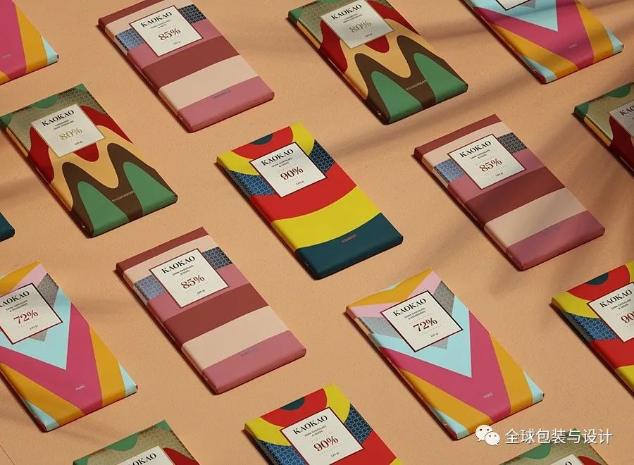
16. KAOKAO kraft chocolate box:
We developed a range of 4 chocolates inspired by the nature, folklore and habits of 4 different countries, Guatemala, Peru, Ecuador and Madagascar. 4 chocolates come in different kraft chocolate boxes, we wanted to convey a sense of calm, joy, simplicity and minimalism for such a delicious product. Simplicity and minimal abstraction make the product unique, different from the classic chocolate bar, a new way of this world - kraft chocolate box.
16. Milki Dulce Natural kraft chocolate box
Several versions of the logo are kraft chocolate box designed in a modern style, the natural shape has not lost its connection with the serif typeface, realizing the function of kraft chocolate box in terms of simplification and application. Then we used black, gold and white to reflect that. These colours allude to the main values of the brand and provide a premium modern feel. To reinforce the brand's presence, our kraft chocolate box accents colours as well as modern graphic patterns and liquid textures to apply to its elegant, simple and dynamic kraft chocolate box packaging.

18. Green Rebels kraft chocolate box
The eye-catching use of high-contrast colors and bold printing on kraft chocolate box packaging is designed to help attract and engage consumers in meaningful and worthwhile causes. The brand is determined to encourage consumers to move with them towards positive change; the structural design of the chocolate bar itself captures this message firmly. The kraft chocolate box footprint design works well at other touch points as well and is a key visual expression of flexibility and consistently high impact. The 3D design of the product also ensures that the brand message is not lost when the kraft chocolate box is removed – emotional engagement continues throughout the product use to ensure maximum impact.

Additionally, the kraft chocolate box’s iconic footprint illustration tells the origin of the product and the brand’s mission to preserve the natural environment in the Amazon region of South America – the iconic home of the humble cocoa bean.

The 3D kraft chocolate box packaging design is made of corrugated cardboard using recyclable and recyclable materials. The texture of the kraft chocolate box material is reflected in the communicative print style on the packaging, helping to further reinforce the brand’s honesty. The back of the kraft chocolate box packaging label showcases the personal story of the origin of the product's ingredients to encourage consumers to use the brand's traceability credentials and to help provide a highly emotional and personal touch.

Bronze medal in five global kraft chocolate box packaging design competitions 2020.
19. J. Kumari kraft chocolate box
The overall design of the kraft chocolate box takes inspiration from the transformative forces of nature: the rich matte kraft chocolate box packaging features leaf-textured details and the intricate crystal structure of shimmering copper. This makes the glossy black body of the logo sparkle and provides a backdrop for the contrasting pattern work, which is also reflected in the painterly art of the finished chocolate candy. The resulting display feels mysterious, intense, and high-end, reflecting the precision of craftsmanship and the artistry of the kraft chocolate box created.

There are three chocolate bars in kraft chocolate boxes and three different quantities of chocolate candy cartons of 2, 4 and 16. All adhesive boxes have an envelope and the chocolate bar has a hand-applied label that wraps front to back.
